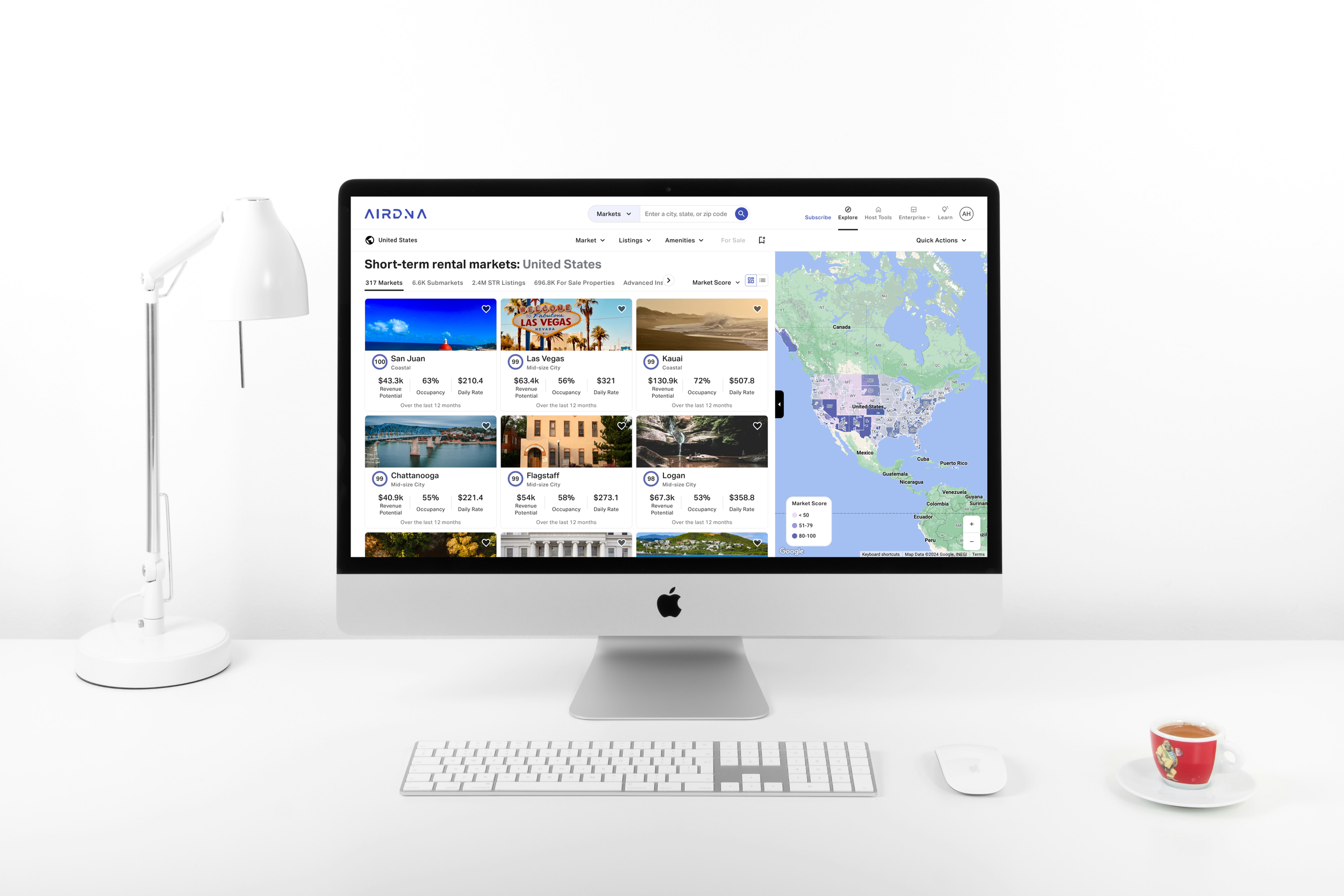
AirDNA App Redesign
Introduction
Overview
AirDNA is a platform that provides short-term rental data and analytics for investors, property managers, and real estate professionals. The goal of this project was to redesign the AirDNA app to enhance user experience, improve usability, and ensure that the design aligns with the needs of its diverse user base.
My Role
Supporting UX Designer. Responsibilities included wireframing, responsive screen high fidelity mockups, prototyping select user flows, and collaboration with the lead designers regarding visual design and implementation.
Redesigned AirDNA app
Research
User Interviews
AirDNA conducted interviews with many users, including real estate investors, property owners, and data analysts.
Key insights included:
- Users needed a streamlined way to access and interpret data
- There was a desire for clearer, more understandable dashboards
- Users found the existing app’s navigation unintuitive
Competitive Analysis
The team analyzed several competing platforms to identify best practices and areas for differentiation.
Key insights included:
- Emphasis on user-friendly data visualization
- Importance of easy to use features to cater to various user needs
- Effective and simple use of onboarding process to guide new users
User Personas
Problem Statement
Prior to the redesign, the AirDNA app faced several issues, including:
Complex Navigation: Users struggled to find key features and data due to a cluttered and outdated interface.
Data Overload: The app displayed too much information at once, overwhelming users.
Inefficient Workflows: Tasks like searching for markets and generating reports were cumbersome.
Inconsistent Design: The app lacked a cohesive visual language, leading to confusion.
Lacking Key Features: Features such as more robust host tools, in depth filtering ability, and For Sale properties are currently lacking.
Old AirDNA app
Design Process
Information Architecture
We redesigned the app’s information architecture to simplify navigation and ensure that key features were easily accessible. This involved:
- Creating a Sitemap: Organizing content into logical categories.
- Defining User Flows: Mapping out the steps users take to complete key tasks.
Wireframing
Mid- and high-fidelity wireframes were created for key screens to establish layout and functionality:
- Market Overviews: Simplified data visualization with clear and tangible takeaways
- Market Search: Streamlined search functionality with advanced filters.
- Reporting: Enhanced reporting tools with export options.
Prototyping
High-fidelity prototypes were developed using Figma, incorporating visual design elements:
- Clean, Modern Aesthetics: Using a cohesive color scheme and typography while establishing a robust design system.
- Interactive Elements: Ensuring smooth transitions and interactive components.
Solution
Key Changes
- Streamlined Navigation: A revamped navigation menu with clear labels and a search function.
- Enhanced Data Visualization: Improved charts and graphs that are easier to interpret.
- Robust Filters: Improved filtering allowed users to hone in on what matters most to them.
Visual Design
- Consistent Visual Language: Applied a unified color palette and typography throughout the app, and established a robust design system.
- Responsive Design: Ensured that the app is fully functional on both mobile and desktop devices.
New Features
- Host Tools: Tools for hosts were expanded upon, offering more powerful resources for owners of STRs to manage their listings.
- For Sale Properties: Users are now able to search for For Sale properties which will help them understand what’s available in their target markets.
- Subscription Changes: Instead of purchasing by market, users are now able to pay a flat monthly or annual fee to use the app.
Reflection
What went well?
- Clear Goals: Defining clear goals and user needs helped focus the redesign and deliver a valuable product.
- User-Centered Design: Incorporating user feedback ensured the final product met user needs.
- Team Effort: The redesign was a huge team effort, with buy-in from product management, engineering, marketing, and beyond.
What were the challenges?
- Balancing Complexity and Usability: Ensuring that the app remained powerful while being user-friendly was a challenge that required an immense amount of iterative design and testing.
- Timeline: The timeline to complete the entire redesign and release it to users created some constraints on the overall release, and some features had to be put on hold for development.
Conclusion
The redesign of the AirDNA app successfully addressed the major usability issues, resulting in a more intuitive, visually appealing, efficient, and user-friendly experience. The project highlighted the importance of understanding the user to create a product that truly meets user needs. Future improvements include continuing to offer more robust features to users, and continuing to make the platform more intuitive and easy to understand for various experience level of users.


